Always Faithful Home Improvement
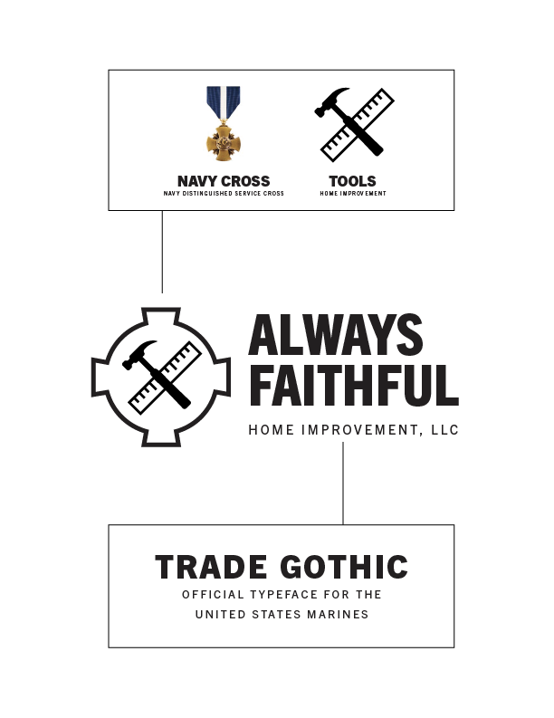
Creating the brand for a construction firm was an enjoyable challenge. The design needed to encompass three vital aspects: construction, faith, and service within the Corps.
Skills Used

Adobe Illustrator
Brand Guide
Color Theory
Design Strategy
Branding
Illustration
Sketching
Graphic design
Below are the three concepts I came up with for the client.
For each concept, I have outlined my thought process and the reasoning behind the design choices.


The client chose the option with the house.
The next phase was narrowing down a brand color to finish the logo. The client went with a blue, black, and white combination that pops.
I really love how the logo came together to make a clean and meaningful design.
